Did you know that more people now browse the web on their phones than on desktops? With mobile browsing surpassing desktop use, websites need to adapt. Mobile-first design prioritizes mobile users, ensuring your site performs better on phones before scaling up to desktops. This isn’t just a trend—it’s essential for delivering a great user experience, improving SEO, and staying ahead of the competition. Whether you’re seeking Web Design Sacramento or looking to enhance your own website, embracing mobile-first design is no longer optional. Keep reading to learn why this approach is vital for success in today’s digital world.
What Is Mobile-First Design?
Mobile-first design means creating a website starting with how it looks and works on a phone. Since most people now use phones to go online, this design makes sure the site is easy to use on small screens. Once it works well on mobile, designers then adjust it for tablets and computers. This way, the site works great no matter what device someone uses.
The Rise of Mobile Usage: Why It’s a Game Changer
People use phones for almost everything now—shopping, reading, watching videos, and even doing work. More people visit websites on phones than on computers. If your site isn’t made for mobile, visitors may leave fast. A website that’s hard to use on a phone can lose customers and hurt your business.
Google’s Mobile-First Indexing: Why It Affects You
Google wants to show the best websites in search results. To do that, it looks at the mobile version of your site first. This is called mobile-first indexing. If your mobile site is slow or hard to use, it can hurt your spot on Google. That means fewer people will find you online. A mobile-first design helps you stay visible in search results.
User Experience: Mobile-First Design and Better Engagement
If a website is easy to use, people stay longer and come back. Mobile-first design helps with that. It makes sure text is easy to read, buttons are easy to tap, and pages load fast on phones. When visitors can use your site without trouble, they’re more likely to trust your brand or buy something from you.
Mobile-First Design vs. Desktop-First: Why Mobile-First Wins
Desktop-first design starts with big screens and shrinks things for phones. But that doesn’t always work well. Things can break or look messy on small screens. Mobile-first design does the opposite. It starts simple and grows from there. This means your site will always look clean and work well, no matter the screen size.
Mobile-First Design and Future-Proofing Your Website
New devices come out all the time—phones, tablets, and even smartwatches. A mobile-first site is built to work on all of them. You won’t have to rebuild your site each time a new device launches. That saves time and money and keeps your site ready for whatever comes next.
How to Implement Mobile-First Design: Best Practices
Start by thinking about what people need most on your site when using their phones. Use clear text, big buttons, and simple layouts. Make sure the site loads fast and works well on a small screen. Test it on different devices. Use tools like responsive frameworks to help your site adjust to different screen sizes. Focus on what matters most to your users.
Conclusion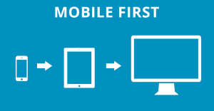
Mobile-first design isn’t just a good idea anymore—it’s something every website needs. It helps your site look better, load faster, and perform well on all devices. It also helps you rank higher on Google and gives visitors a better experience. If your website isn’t mobile-first yet, now’s the time to make the switch.
 :
:
Service/Product Details:
https://webdesignsacramento.us/