Your brand is more than just a logo; it’s a complete visual identity. And one of the most important elements that often gets overlooked is your choice of fonts. Typography plays a powerful role in how your brand is perceived, helping to shape customer emotions, trust, and recognition. Choosing the right font is not just a design decision; it’s a branding strategy.
In this blog, we’ll explore why fonts matter, how they impact your brand image, and where to find quality fonts that align with your business identity.
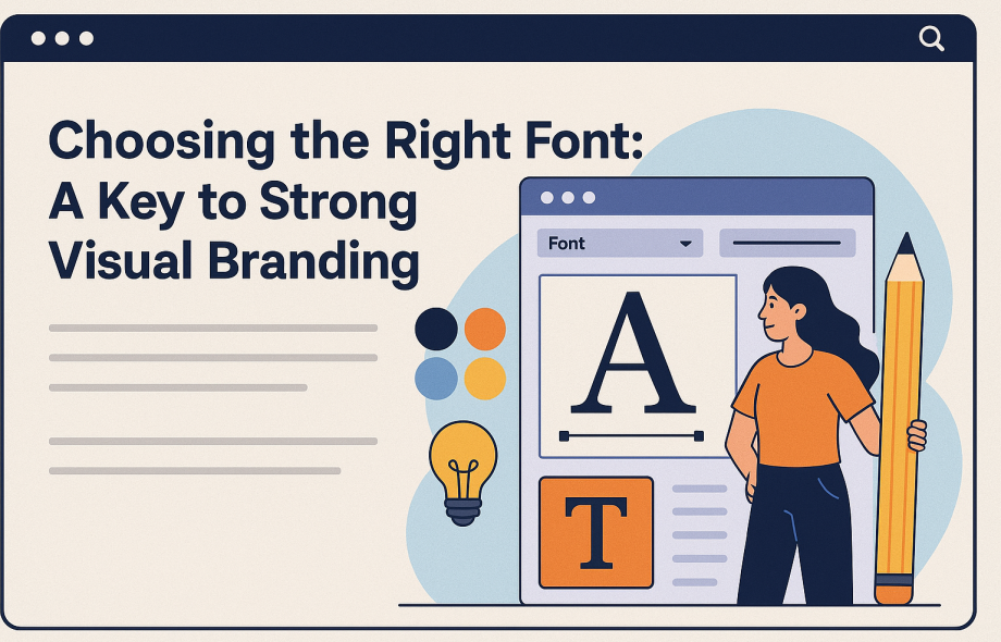
Why Fonts Matter in Branding
Fonts set the tone before a single word is read. They act as a visual cue that tells your audience what to expect. For example:
- A modern sans-serif font feels clean, professional, and forward-thinking.
- A classic serif font communicates tradition, reliability, and authority.
- A script or calligraphy font adds a sense of elegance, emotion, or creativity.
Choosing a font that reflects your brand values helps establish an emotional connection with your audience, a key driver in brand loyalty.
Typography and Brand Personality
Your brand personality should influence your font choices. Ask yourself:
- Is your brand fun or formal?
- Do you want to appear minimalist or expressive?
- Are you targeting professionals, creatives, or general consumers?
If your font doesn’t match your tone, it sends mixed signals to your customers. For instance, using a playful handwritten font for a financial consulting firm could harm credibility, while the same font could work perfectly for a handmade jewellery brand.
Visual Consistency Builds Recognition
Consistency is one of the most powerful branding tools. Using the same fonts across all touchpoints, websites, social media, packaging, and emails helps reinforce your identity. Over time, customers begin to recognise your brand even before they see your logo.
Establishing a clear typography system, including heading fonts, body text, and accent fonts, ensures that your brand remains cohesive and professional.
Usability and Readability Matter
No matter how beautiful a font looks, if it’s hard to read, it won’t serve your brand well. Readability is critical, especially in digital formats where users are skimming quickly. Stick to fonts that are clear on all screen sizes and test how they appear across devices.
Where to Find Quality Fonts
You don’t need to spend a fortune on premium typefaces. There are countless resources offering high-quality Font Free Downloads for personal and commercial use. One of the most popular platforms is Google Fonts, which provides a wide variety of professional, open-source fonts with easy integration for websites.
Always check the license before using a font in commercial projects to avoid any legal issues.
Final Thoughts
Choosing the right font is a small decision with big consequences. The right typography can improve customer trust, enhance brand recognition, and create a cohesive visual identity. By aligning your fonts with your brand personality and ensuring readability across all platforms, you’re laying a solid foundation for lasting brand impact.
 :
https://in.pinterest.com/fontfreedownload/
:
https://in.pinterest.com/fontfreedownload/